
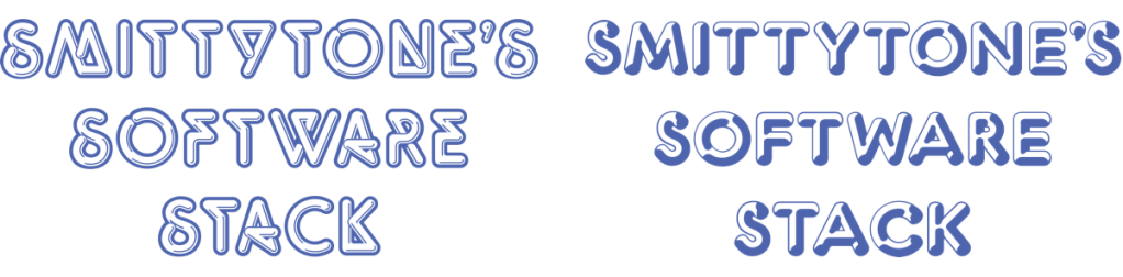
I recently updated the masthead of my software-focused site, smittytone.net. In a fit of nostalgia, I recast it as a series of fonts that I’ve been fond of for years, all of them 1960s, 70s and 80s classics.
I love good fonts — what we used to call ‘typefaces’ — and it’s one of the reasons why I wrote and released Fontismo, an iPadOS app that allows you to install 50 open licence fonts on your iPad. I started using digital fonts back in 1989, on the first Mac I ever used, an SE/30 hooked up to a 20-inch Radius monitor for page layout work with Aldus PageMaker, but my love of fonts goes back to the late 1970s.
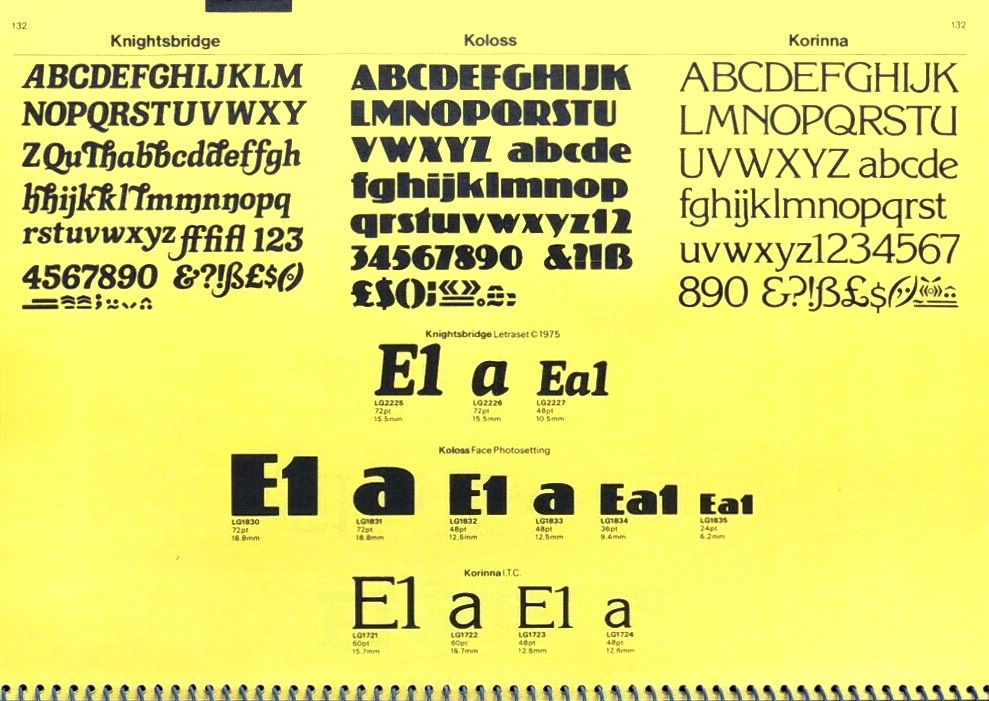
My dad acquired a ring-bound Letraset catalogue. I was immediately drawn to the many fancy typefaces it contained. Some of them I knew from magazines and comics I read, like 2000AD, Starburst and Omni, others from record sleeves and TV shows, but many more were completely new.
When, a few years later, my brother and I established a Doctor Who fiction-oriented fanzine called Black Pyramid, we fell back on that catalogue for our headline fonts. Not by ordering sheets of rub-down transfer lettering, you understand, but by calculating the number of occurrences of the most used letters and making that many photocopies of the relevant page in the catalogue. We snipped out the letters we needed and assembled the headlines by hand, carefully aligning and kerning the headline text over one, two or three decks.
No question it was great practice for laying down digital type professionally in the late 1980s.

We were just kids; we couldn’t afford sheets of Letraset. Not when so many of them were effectively useless once all the Es and Ts had been used up. And even if our pocket money had stretched to a sheet or two of the real thing — we did spend what then seemed to be a small fortune on WH Smith’s small sheets of more traditional rub-down characters — we wouldn’t have been able to obtain anything like the range of typefaces that hacking the catalogue allowed us.
With digital type there’s no waste: use as many characters as you need. No wonder Letraset never really survived the arrival of digital fonts, despite an attempt to get into painting software, reselling Fractal Design’s Painter (now Corel Painter) in the UK. All those catalogues are now collectors items. I wish I still had mine.
Many of the fonts I loved back in the day are available from today’s type foundries, but some are not.
For instance, I wanted to include Pluto Outline among my masthead fonts, but it doesn’t seem to be available anywhere. The closest I could get was K22 Lucifer No.1, which is clearly based on Pluto Shadow. I had no joy with Baby Teeth, either, so I reconstructed the letters I needed from a photo of the relevant page in a Letraset catalogue.
Quicksilver is no longer available either, but I have an amateur’s reconstruction of the 1976 classic that I stumbled upon many years ago. In the 70s and 80s, there was barely a sci-fi novel that didn’t use Marvin on its cover. Alas it has not stood the test of time (travel), but I did find a re-envisioning of it, Marvin Visions, which is close enough to the real thing.

Every time you visit smittytone.net you’ll see the masthead rendered in a randomly selected typeface. In addition to those mentioned above you may also see:
Countdown — regularly seen in 70s sci-fi TV, Space 1999 in particular.
Data 70 — cheque numbers and lots of outer space shows.
Chromium — a shiny, metal look alternative to Quicksilver.
Stop — More 80s, this one, and a favourite since seeing it used on a Cyberman T-shirt.

Many of these have a sci-fi feel, but not all. I’m currently looking to add Shatter and Pump, which are readily available, but also Stripes, Stack, Process, Optex and Cut-in, which are proving a little more tricky to find. Even if I’m not successful, I’ve made a good start at bringing some old font classics to a new audience.
I’d like to thank the website Fonts In Use which I used to discover the names some of the fonts I could picture in my mind but could not recall what they were called. It has an excellent selection of old and new examples of, as it says on the tin, fonts in use.
